
Plot Variables
Borehole Trace Plots
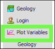
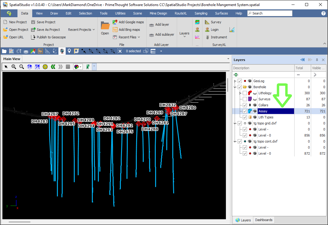
❖In GeologXL, the Plot Variables tool can be used to create borehole trace plots based on some variable. Before bringing up the tool make sure to highlight the layer you want to create plots for in the layer control, in this example it will be my borehole Assay layer:
❖Then, click on the tool, this will bring up the Variable Plot dialogue. The Setup tab is where you will choose your parameters for the variable plot:

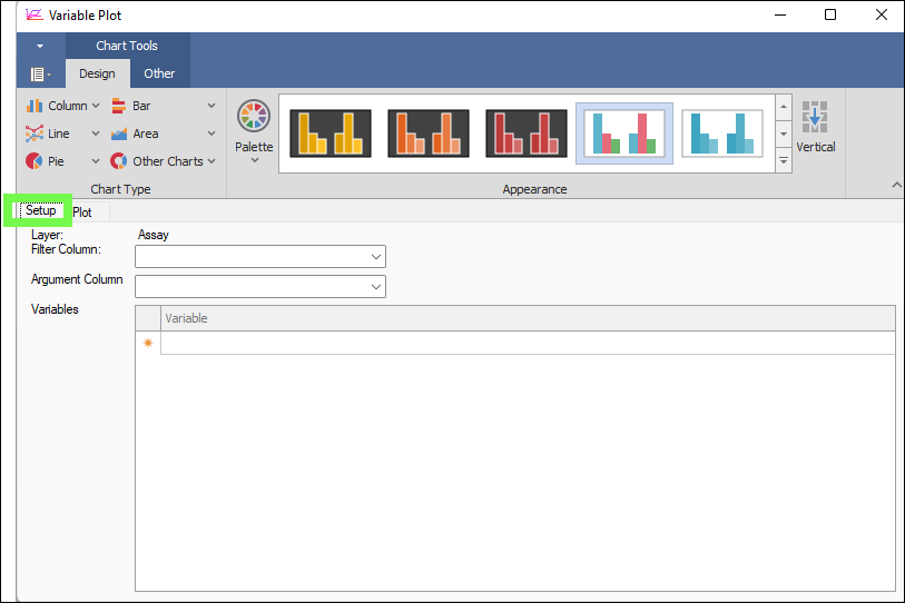
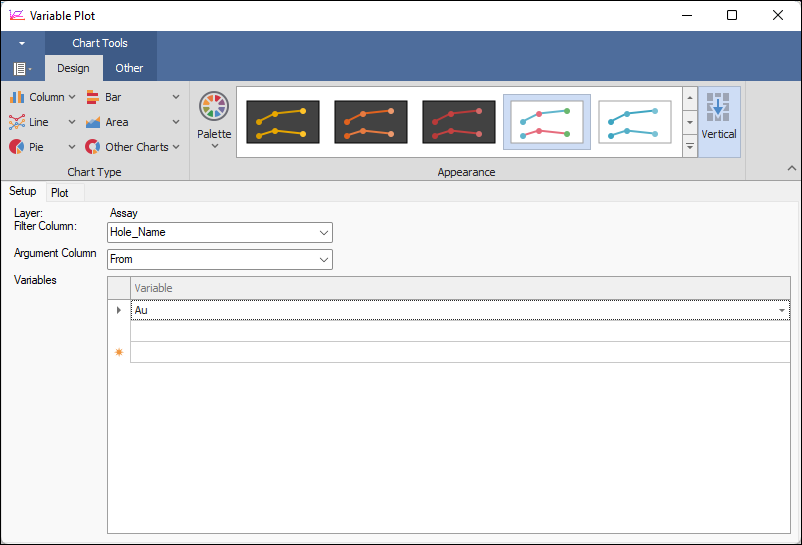
❖The Layer is Assay as that is what I had highlighted before opening the tool. Then, Filter Column will be the main characterizing column that is used to display, and in this case, it will be the Hole_Name which represents my boreholes. Then Argument Column is the column in the data that is used to plot the variable against, and this will normally be the depth down the borehole and so I will choose the From column.
Lastly, by Variables you will choose the column or columns with the variable/s that you want to plot, and in this case it will be the Au column in my Assay data representing gold values:
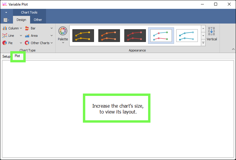
❖Now that we have set up all our parameters we can go to the Plot tab where we will see our borehole plots. Now because there are 26 boreholes that I am plotting it is hard to show all those plots at once and the dialogue tells me to increase the chart’s size to view it’s layout.
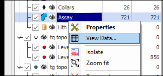
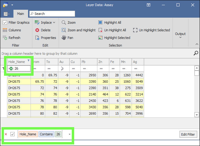
So what I will do is open the layer data grid of my Assay layer to filter on specific boreholes so I can see the plots nicely:
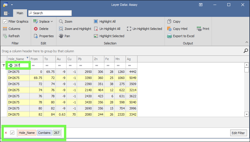
Here I filtered on all boreholes containing 267 in their Hole Name.
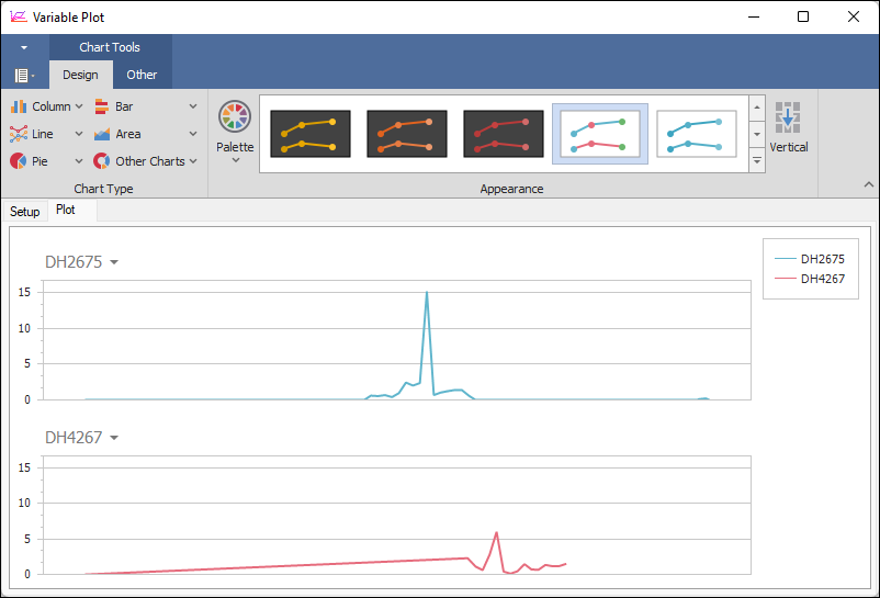
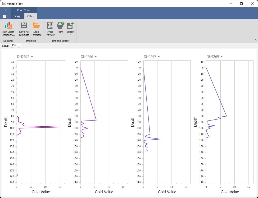
❖Now, if I go back to my Setup tab and then back to the Plot tab to refresh it, I will see the borehole plots of the gold values down the borehole for the specific boreholes I filtered on:
❖To make these graphs vertical I can click the Vertical button in the ribbon above:
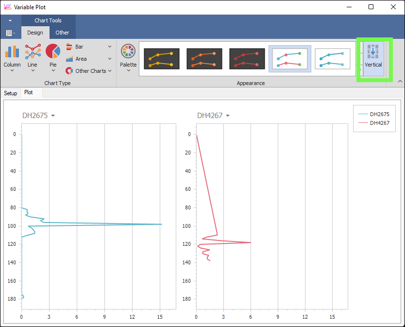
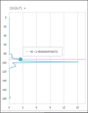
❖I can hover over the graphs to see the gold values at each depth down the borehole:
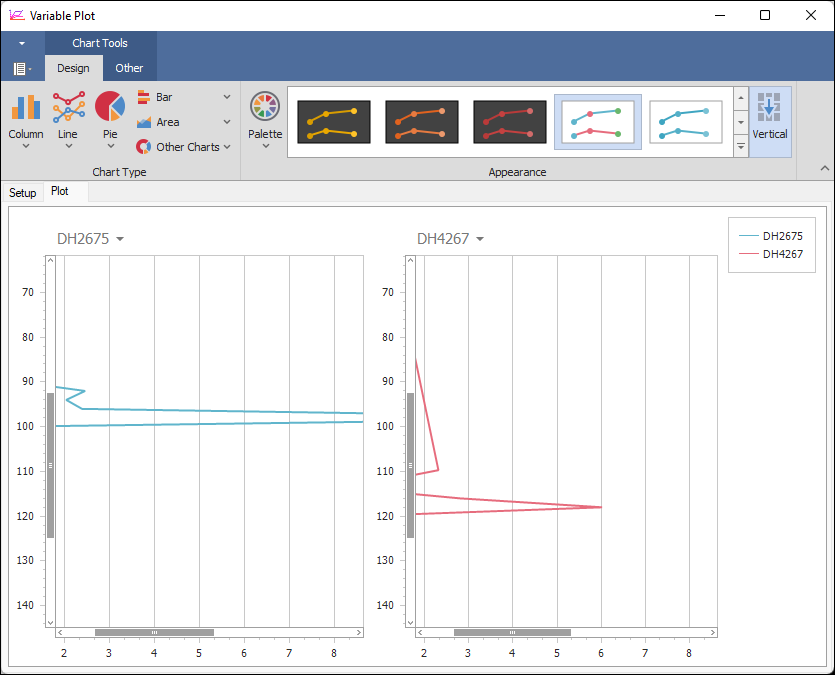
❖You can zoom in and out on these graphs by hovering over the graph and mouse wheeling in and out; to zoom in on the X or Y axis of the graph only, hover your mouse on the X or Y axis values
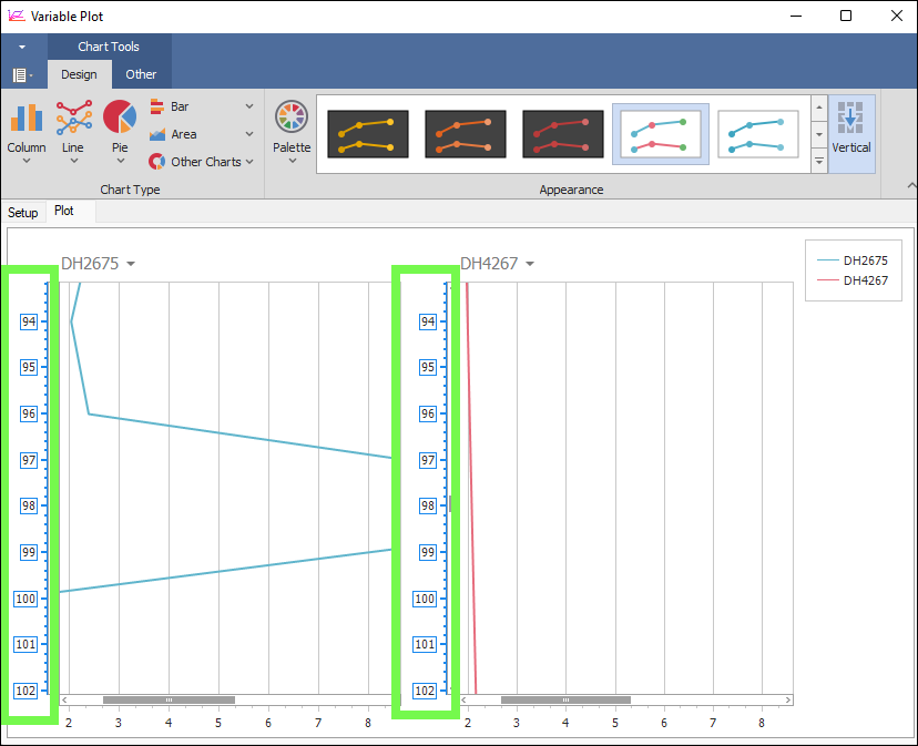
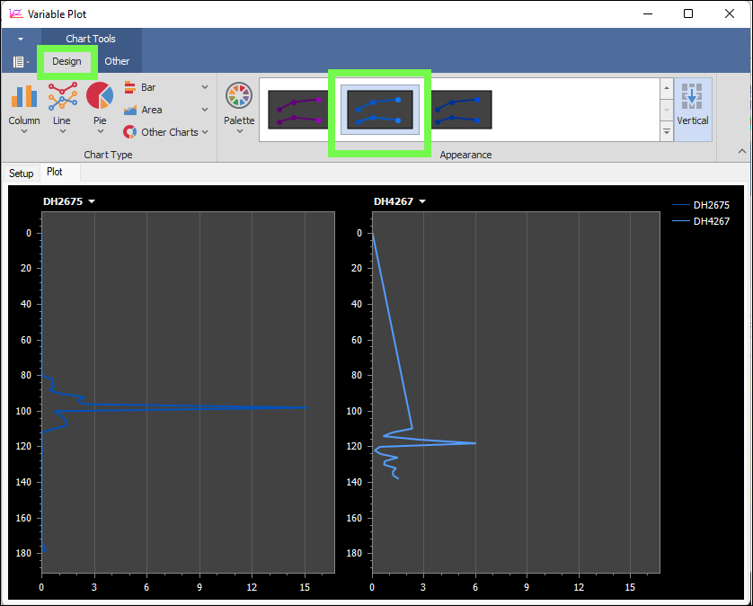
❖In the Design tab you can change the style of the graph, for example here I chose a different style under Appearance:
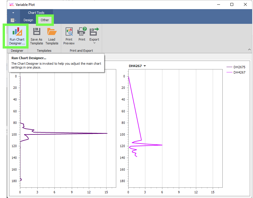
❖In the first section of the Other tab you can run the Chart Designer and specify various properties about the chart, such as the X and Y axis settings, legend settings etc.
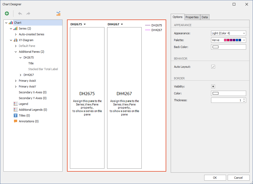
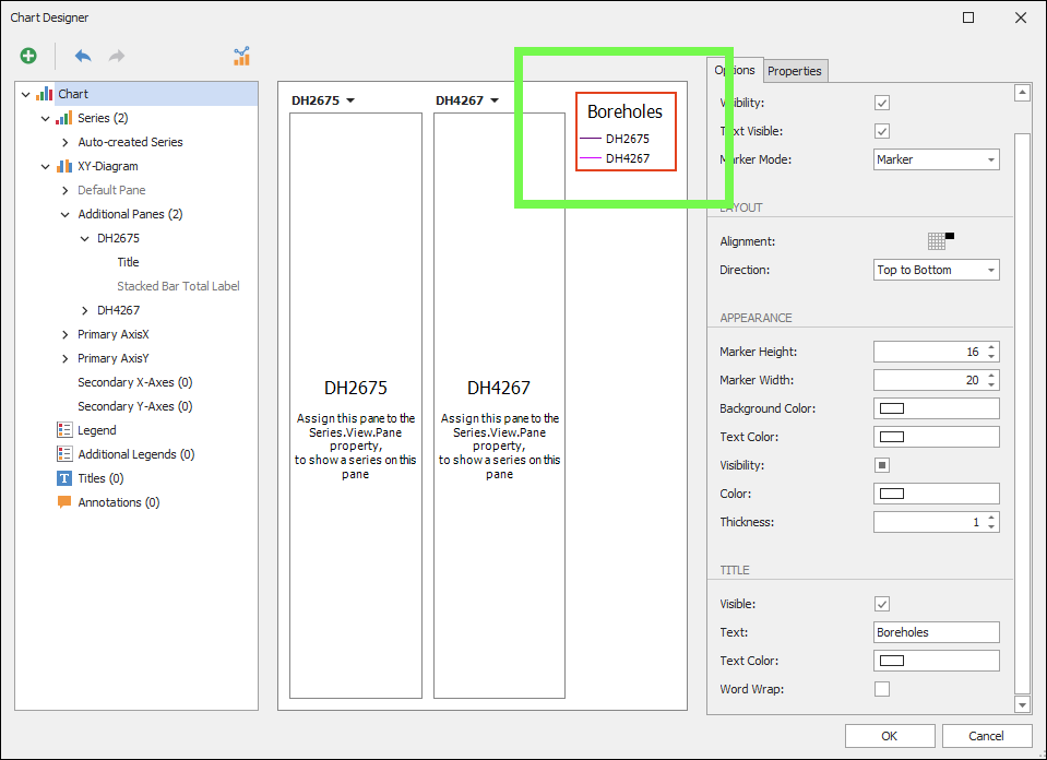
As you click on one of the chart elements in the left pane, the properties for that item will show up on the right in the Options and Properties etc. panes. A preview of the changes you make is shown in the middle pane.
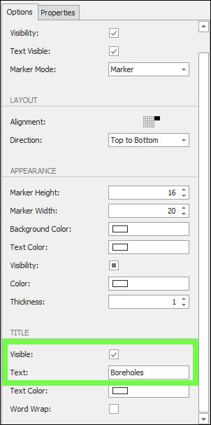
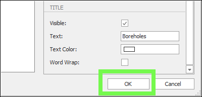
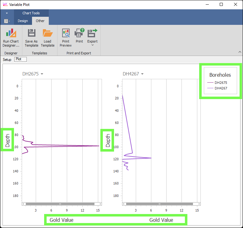
❖For example, here I will edit the legend for the plots by giving it a title called ‘Boreholes’:
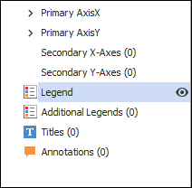
(The legend can be turned on or off by clicking the eye)
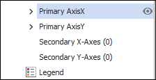
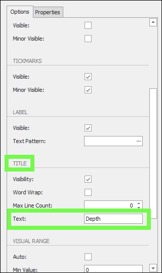
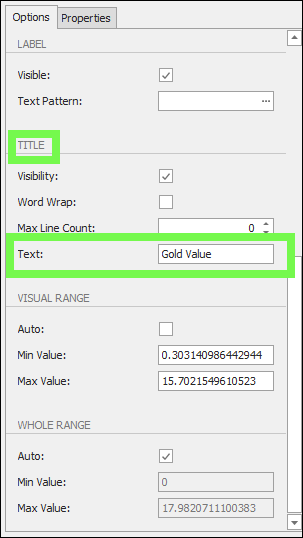
❖What you might also want to do is add labels for each axis so you know what value they represent. Here I will click on Primary AxisX and call it ‘Depth’ and then Primary AxisY and call it ‘Gold Value’:

❖When you are done with your changes in the Chart Designer click OK:
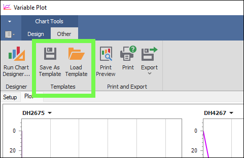
❖You can save a template of your settings for your plots and then load this template in any time:
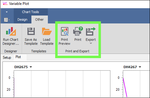
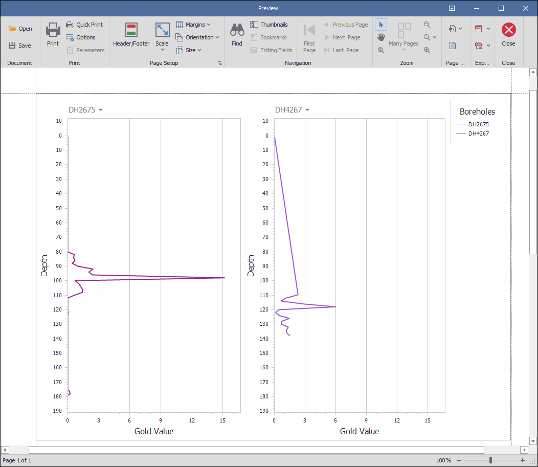
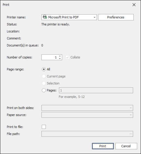
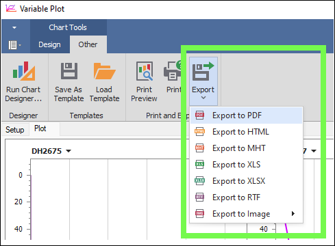
❖You can also get a Print Preview of your plots you have set up and Print this or Export to PDF etc.
❖As I continue to filter out the data in the Layer Data Grid of my plot layer, the borehole plots will update:
❖The tool will remember your settings for each layer that you set up plots for, so if I close the tool and reopen it with the correct layer highlighted in the layer control, my settings I set up before will be there still.