
Dashboards
❖Dashboards is a feature in SpatialXL and all our spatial products that allows you to get various graphs and data out of your spatial data in graphics for analysis.

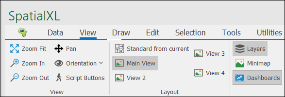
❖Dashboards can also be accessed from the View tab and selected if it is not present as a tab next to Layers.
Licensing
❖To create Dashboards, you require a Bi description in your license file. If you do not have this description in your license file, you will only be able to view Dashboards that have already been set up.
![]()
Designing Dashboards
❖Select the Dashboards tab and click on Add a Dashboard.

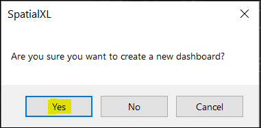
❖A window will come up. Click on Yes.
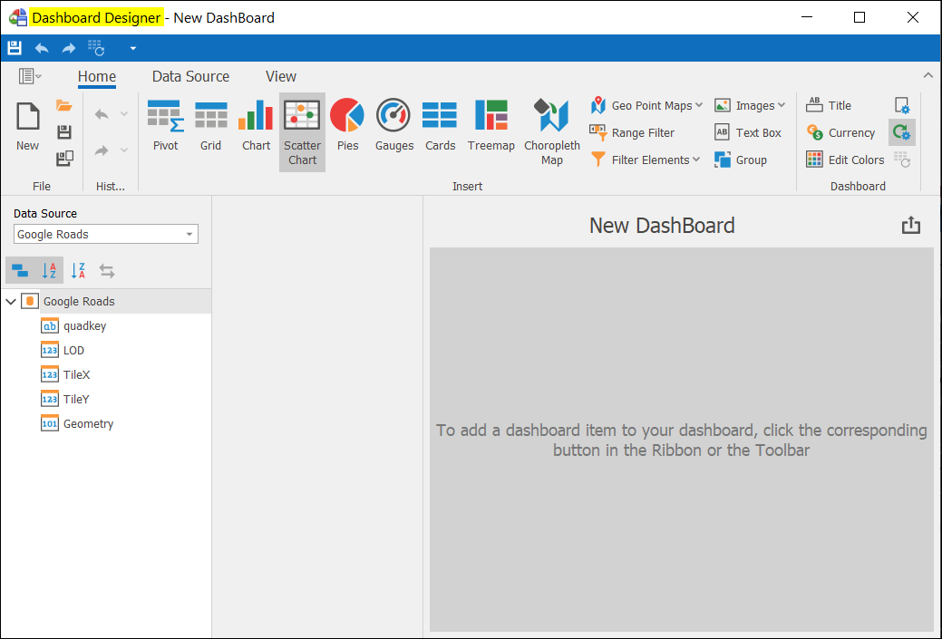
❖The Dashboard Designer will open now.
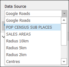
❖Choose the appropriate Data Source that you would like to create Dashboards for. In this example I chose the layer POP CENSUS SUB PLACES as my Data Source.
❖In the Home tab is where you can select in what form you want your information to be displayed. Chart is chosen in this example.

❖All the columns that are in the POP CENSUS SUB PLACES layer are displayed. Choose a column you would like to display on the Chart you selected. I chose DOM_AGE. Click and drag this column onto the Value block under Values in the DATA ITEMS section.
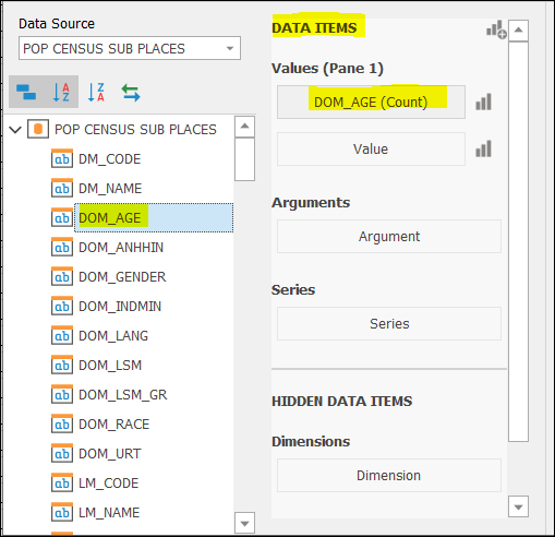
❖DOM_AGE value is by default (Count) as this column doesn’t have purely numeric values to do (Sum) etc.
❖To display the different age categories, select DOM_AGE again and drag it onto Argument block under Arguments.
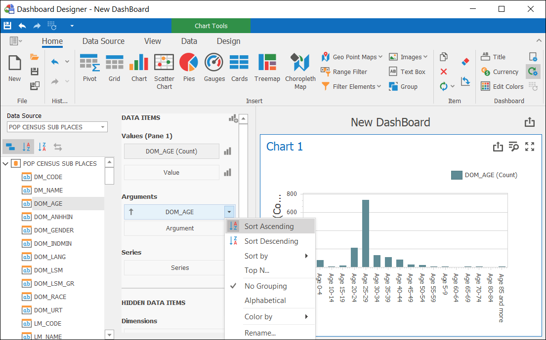
❖Right click DOM_AGE under Arguments where you can choose how to arrange your data on the Chart. Sort Ascending is chosen in this example.
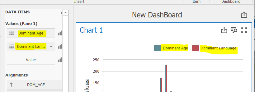
❖Continue choosing and dragging columns in this way that you want displayed on the Chart.
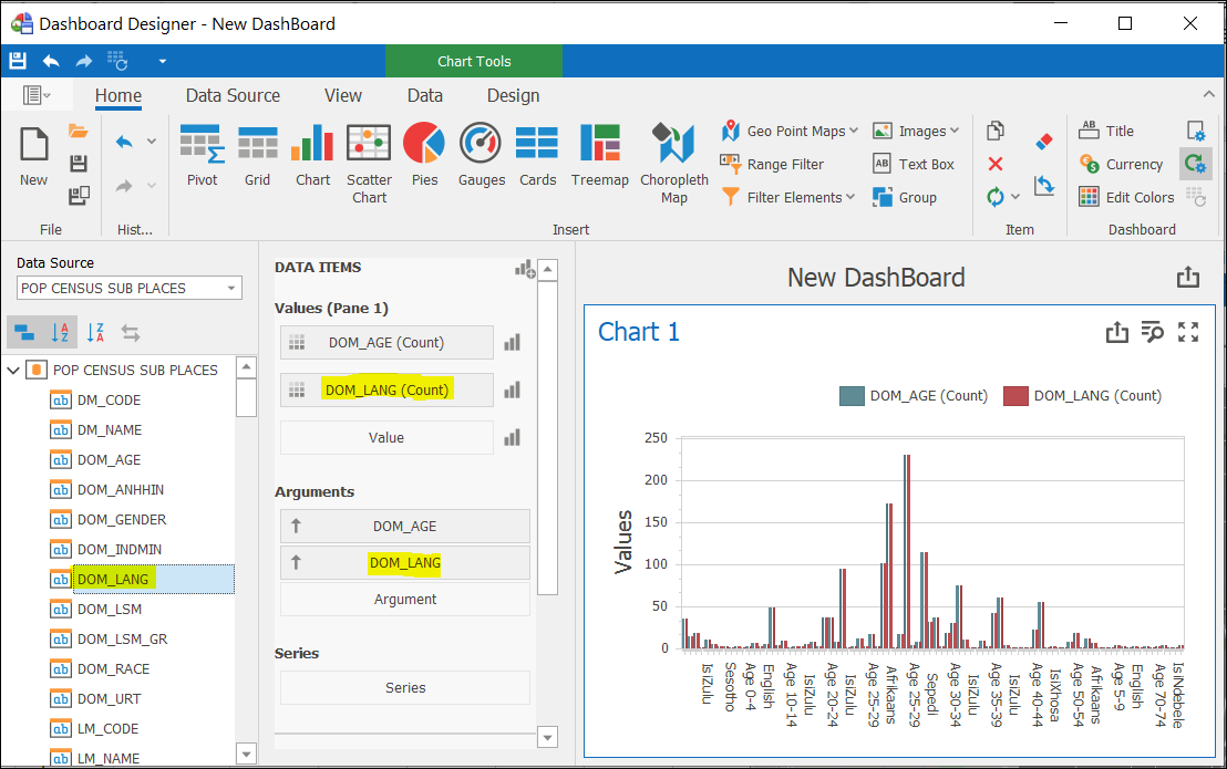
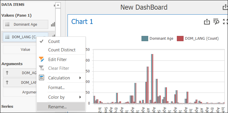
❖You can rename DOM_AGE(Count) and DOM_LANG (Count) Values that are displayed on the Chart by right clicking and selecting Rename.
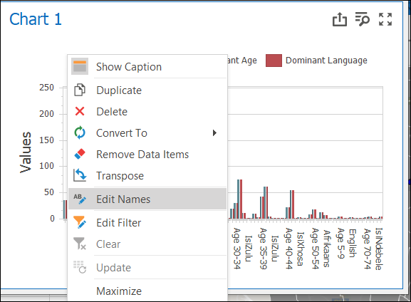
❖To change the name of Chart 1, right click anywhere in the chart area and select Edit Names. A window will open where you can change the name of your Chart etc.
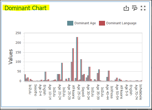
❖You can add various graphs, charts, etc. to be displayed on your Dashboard at the same time.
❖Next example is to select Gauges from the Home tab.

❖Click on MALES and drag it onto the Actual block under Gauges under DATA ITEMS. Do the same with the FEMALES column onto the next Actual block.
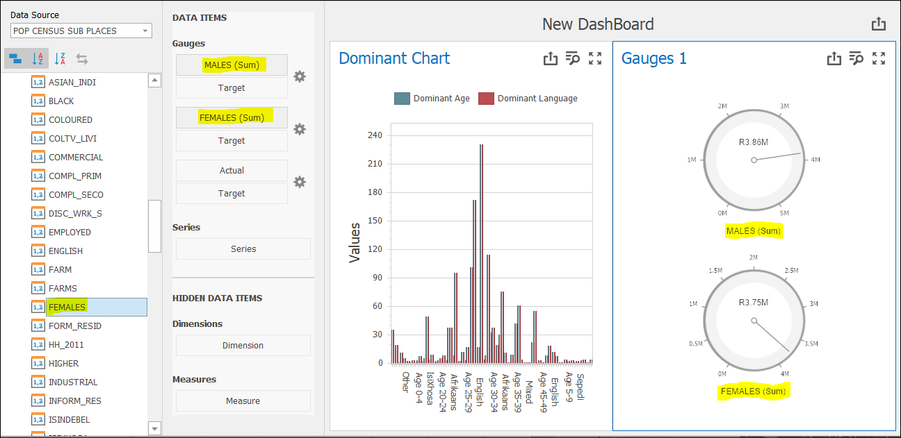
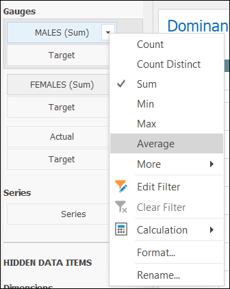
❖The default operation as you can see is (Sum) for both the columns as they only contain numeric values. You have an option of right clicking MALES (Sum) and FEMALES (Sum) and choosing a different operation from the list like Average etc.
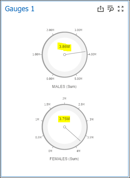
❖As you can see on the Gauges above, the format is R (Rand) which is not applicable for the data I want to display. To change this, click on the cog wheel next to MALES (Sum) and select the Format tab. Select Actual value then for Format type, choose Number. Click OK.
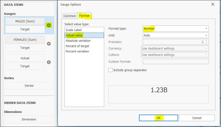
❖Do the same for FEMALES (Sum). (Note: There are many other settings you can adjust in the Gauge Options window.)
❖You can even choose a different Gauge design by going to the Design tab and selecting the appropriate option.
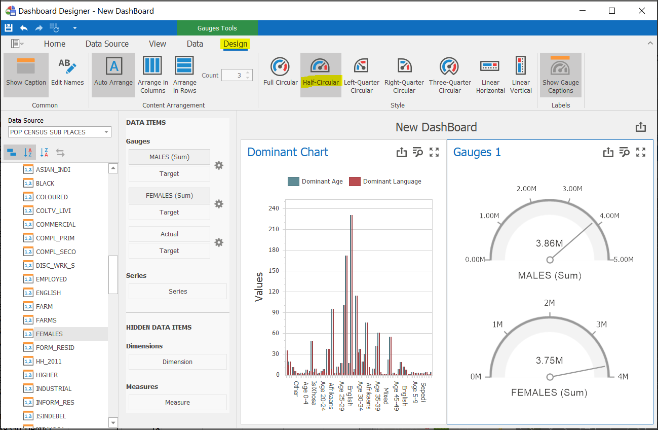
❖Gauges 1, MALES (Sum), and FEMALES (Sum) can be changed per the above instructions.
❖Dominant Chart and Gauges 1 set up thus far have been from the same Data Source — POP CENSUS SUB PLACES. In the next example, I am choosing another Data Source – SALES AREAS which is also one of my layers.
❖I would like to add a Text Box this time for my Dashboard.

❖I would like the average population count, so I set this up under DATA ITEMS as described previously.
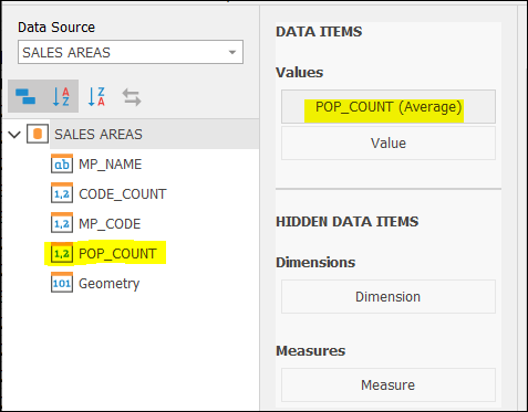
❖Type in any text you would like in Text box 1 — Double click in this box to be able to do this.
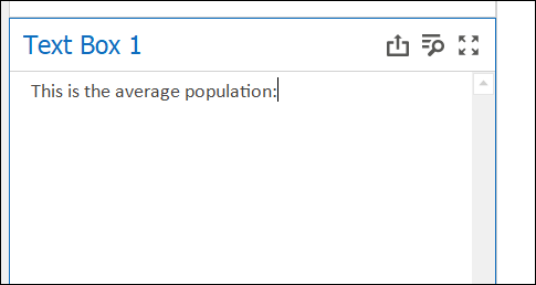
❖Move your cursor in this box to the point where you would like to insert values. Right click there and select Insert Field. Select value will now show.
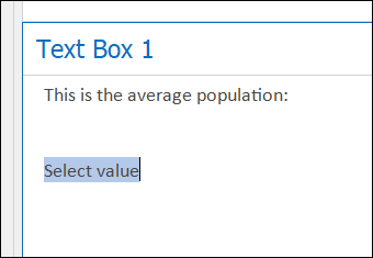
❖Click Select value. I had only set up one field POP_COUNT (Average) in this example so I will click on it to choose it. If you had more than one field set up, then you could choose what you wanted to insert.
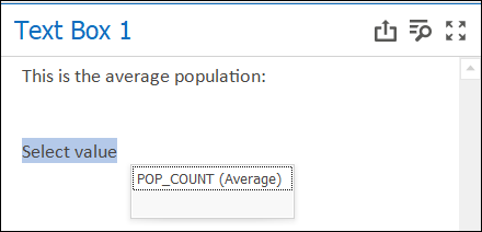
❖POP_COUNT (Average) will be displayed.
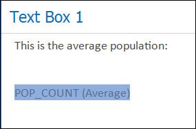
❖If you click out of Text Box 1 on another area on your Dashboard, you will see the actual number for POP_COUNT (Average). This is the average population of the entire layer data.
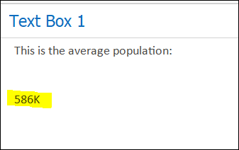
❖At this point you could consider your Dashboard complete. There are many other features in the Dashboard Designer that are available. Only the very basics were gone through. Understanding the above, the rest is self-explanatory.
❖Click on Save to save your current Dashboard.
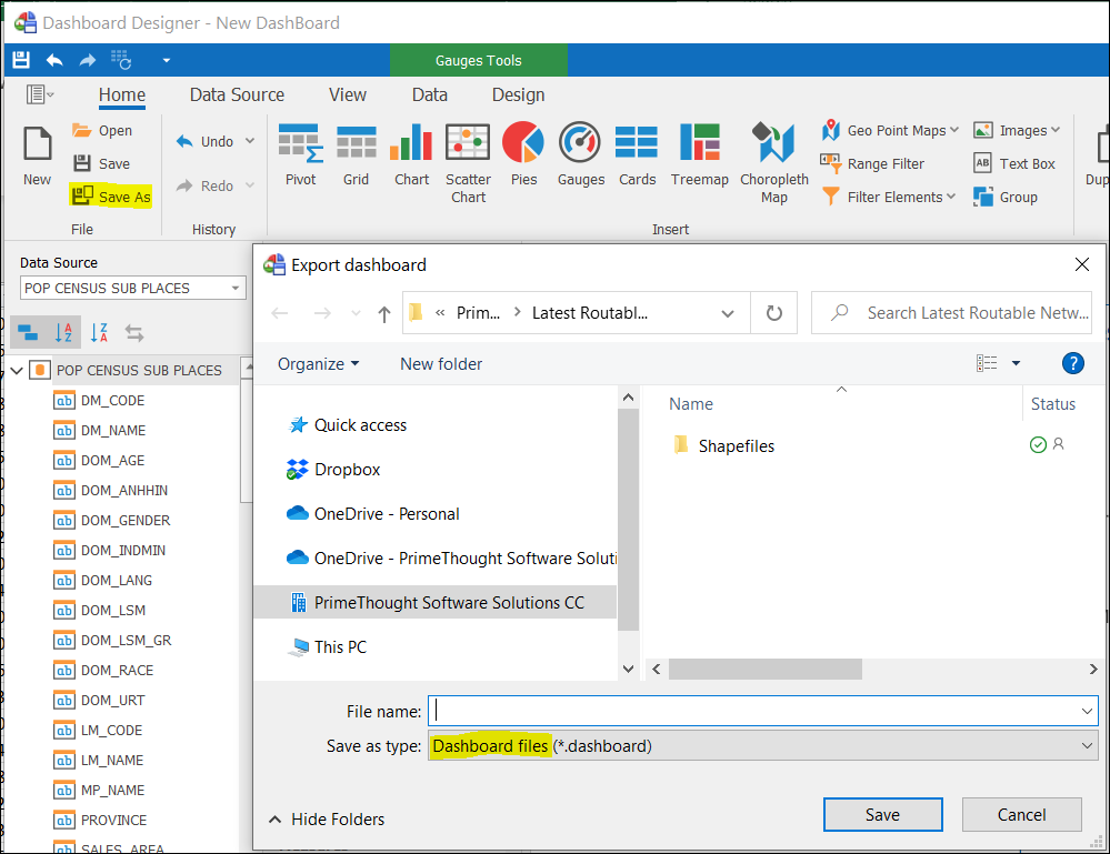
❖Click on Save As to save your Dashboard as a Dashboard file.
❖Click on Open to open a previously saved Dashboard file. (Note: If you try and open a Dashboard file that was created from another workbook with different layers, it won’t display saved data correctly.)
❖When you first opened Dashboard Designer an item New DashBoard was automatically added to the Dashboards tab.
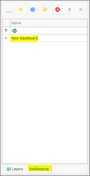
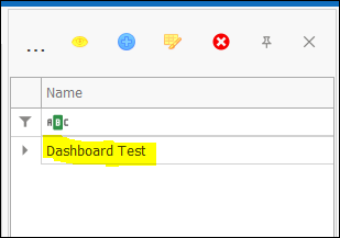
❖Since you are complete with designing your current Dashboard, you can close the Dashboard Designer window and click New Dashboard where you can change the name of your Dashboard.
Viewing Dashboards
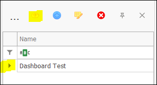
❖Click on the View Dashboard icon to view the dashboard that was just set up – Dashboard Test. If you had another dashboard set up, you would first select that dashboard then click on View Dashboard.
❖The Dashboard Viewer window will open. The numbers being displayed are totals of all the data. Filter on Selected is not checked on.
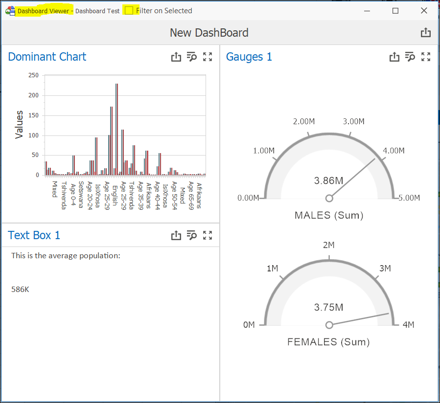
❖To get out numbers of selected items, check on Filter on Selected.
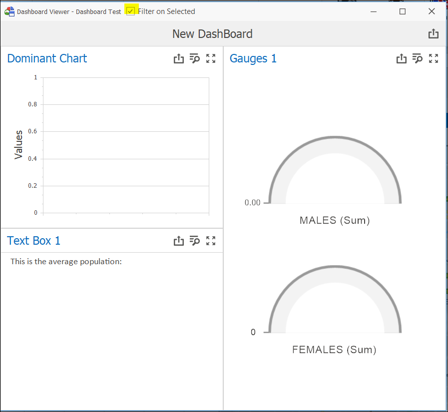
❖There is no information displayed here yet as no items have been selected yet on the graphics. Go to the Layers tab and ensure the layer that is referenced as the Data Source for your Dashboard is checked on.
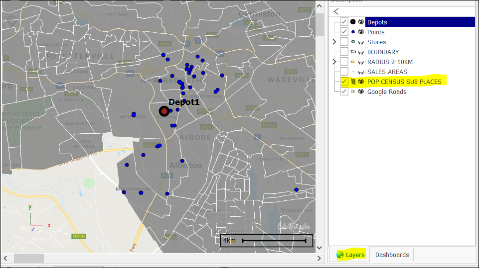
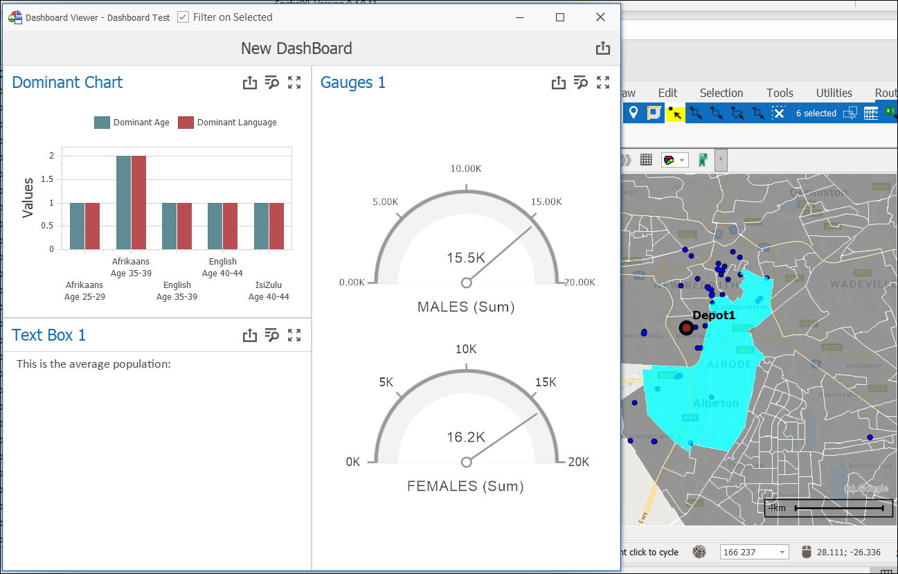
❖Now select an area or areas using one of the selection tools. The exact numbers for the selected areas will be displayed on the Dashboard Viewer.
❖Note: Text Box 1 number will not be displayed if Filter on Selected is checked on as this was created from a different Data Source – SALES AREAS.
❖To display the value in Text Box 1, ensure SALES AREAS is checked on in the Layers tab. Then using one of the selection tools, select 2 or more areas from this layer. The average population number will then be displayed.
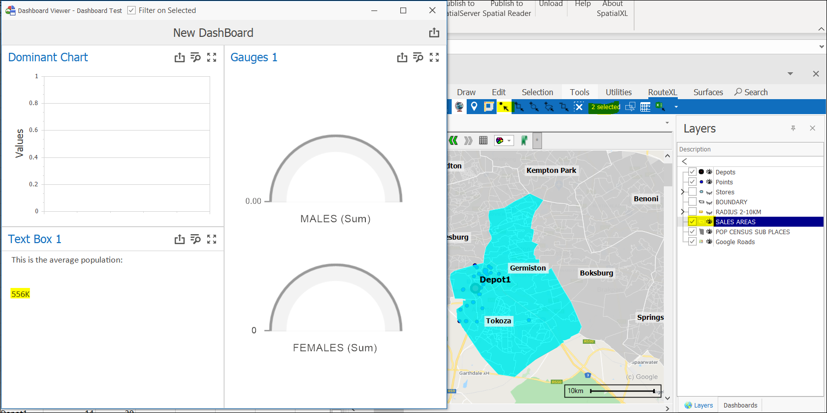
❖No data will be populated for the other items on the Dashboard Viewer as the Data Source is the layer POP CENSUS SUB PLACES for them. Only areas from the SALES AREAS layer are selected.
❖If you would like to change any design in any Dashboard from the Dashboards tab, select the appropriate Dashboard and click on the Design Dashboard icon where you can do this. Save your settings.
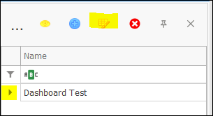
❖You can add as many different Dashboards as you want here by clicking ![]() .
.
❖To delete a Dashboard, first select it then click ![]() .
.
❖You can inspect the data of the various charts etc. set up on your Dashboard by selecting the Inspect Data icon.
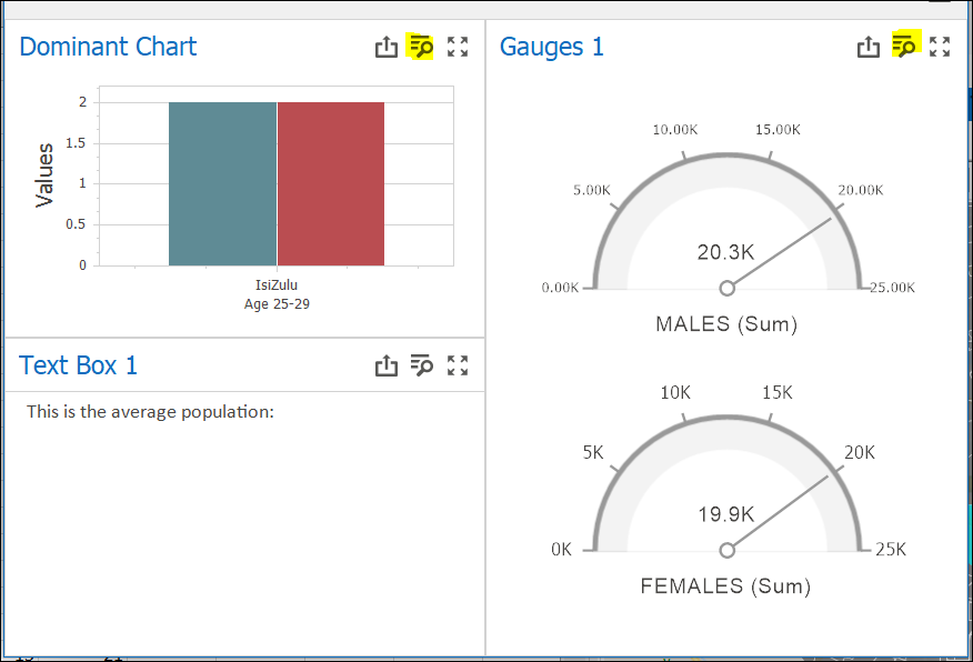
❖Click on the Maximize button ![]() to expand any chart etc. to the full area of the window.
to expand any chart etc. to the full area of the window.
❖You can Export each chart etc. to Image, Excel, or PDF. You can even get a Print Preview. You do this by clicking the Export To icon above each chart etc. and then selecting the appropriate option.
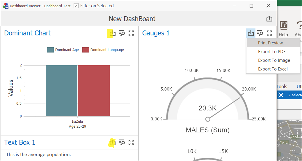
❖To Export or have a Print Preview of the entire Dashboard, select the Export To icon on the top of the Dashboard.
Note: First expand the entire Dashboard window so you can see all items otherwise it will be cut off when exporting.

Publishing Dashboards to Spatial Reader Files
❖You need a specific description in your license file to publish Dashboards to Spatial Reader files. If you do not have this description in your Spatial Publisher license file, you will be able to publish everything else in the spatial product you are using except for Dashboards.
![]()